I have had the
privilege to work for Barnes & Noble for over eight years now. Every week I
go to work, I am always finding new, inspiring things. So as a way to remind me
of all this inspiration, I have decided to share my finds with you through BNspired which I hope will be a weekly
post—Enjoy.
Welcome to week 2 of BNspired! Today I have another
inspiration piece—and the finished project from last week’s inspirations.
I’ll admit it, I am a fontaholic. I love fonts!! That is why
I have almost every Cricut cartridge that includes a font. That is also the
main reason I originally purchased a Silhouette, so I could cut titles from any
True Type font. So don’t be surprised if quite a few of these posts include
fonts or title treatments like this one:

I love that the letters in this title look hand cut and I
really like that a few of the letters have been shadowed with an outlined
letter. I will definitely be trying this
letter treatment on a future layout.
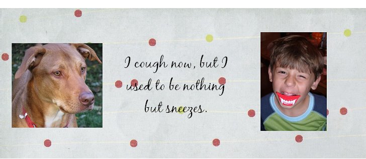
And here is the layout (#206) using one of last week’s
inspirations, the stitched stationary kit.

I started with the tree, which I made ombre by using three
different shades of green. I was loving the look so much that I decide to copy
the Ho Ho Ho as my title and then finish off the layout with a stitched boarder
around my photo collage. I really like the way it turned out.
Fine print-Prices and
availability may vary by store. Barnes & Noble is not affiliated with this
blog/post and has not compensated me in any way for this endeavor. Opinions expressed are solely my own and do not
express the views or opinions of my employer.
No comments:
Post a Comment